Aviation Study Guide
- Education -
Story behind
The “Aviation Study Guide” app is the place where you can find all possible info on Apache AH-64D and Blackhawk UH-60A/L helicopters, as well as more models to come in the future.
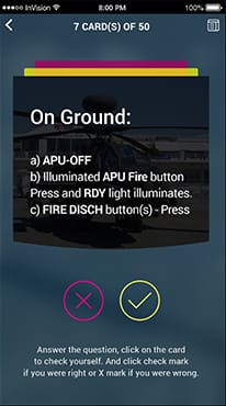
Once you've obtained and studied the information you were looking for, you can test your knowledge through flashcards, suggested by the app, and check how well you studied. Aviation Study Guide features nice shuffling and easy to use options. In addition, you can review any questions that you were unsure of at the end of the test. The included forums and community publications will be helpful tools to ask for what you were not able to find.
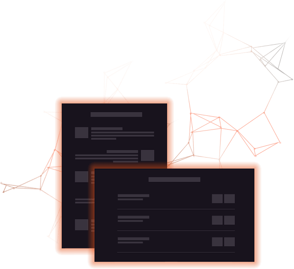
We started from scratch with only a simple .docx document and few requirements in it. See it below:
Flashcard UI
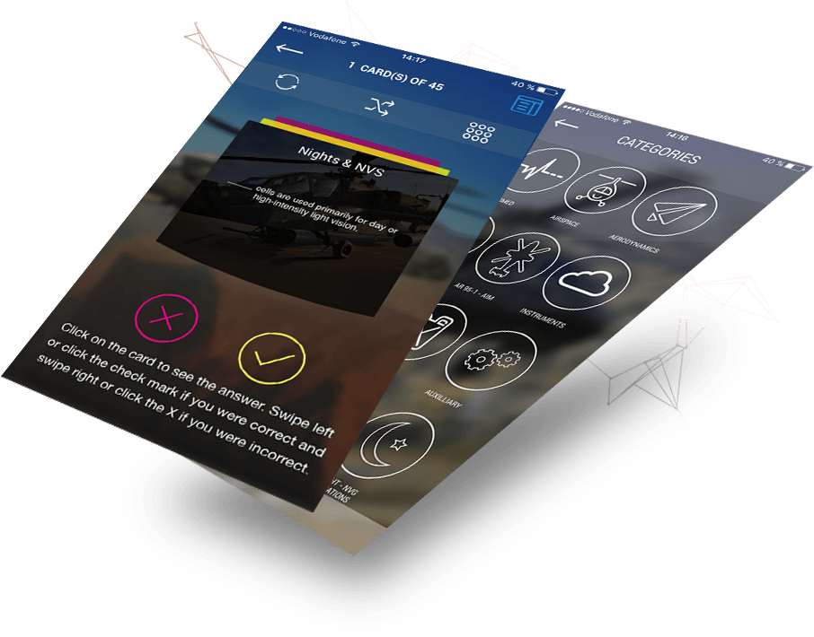
This is a core app's feature that lets users repeat and memorize previously covered materials. Flashcards themselves are a set of yes/no questions or true/false statements. By tapping on a flashcard the answer appears. After that, the user can either swipe left/click the check mark if he was correct, or swipe right/ click on X if he wasn't. At the end of the flashcards set should be an option to shuffle cards and pass again or to review mistakes.

Publications UI
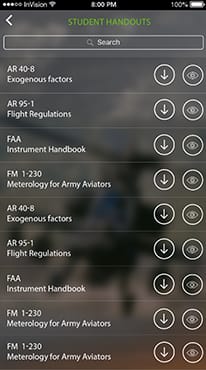
The app should also contain a list of PDF files covering different topics of helicopter maintenance and piloting. Users should be able to either open a file without leaving the app or download it to view offline. In order to simplify the work with publications, we need to integrate a search function, so users could quickly browse through the document.
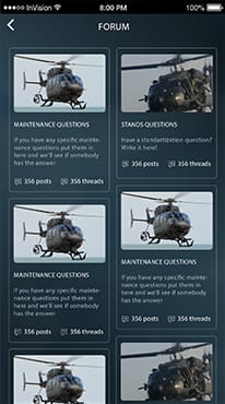
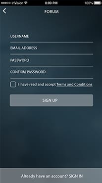
Community Forum UI
Aviation Study Guide should have a simple forum where people can ask questions and look for additional information within the app. After signing up, users should be able to either create or discuss topics and share information with each other.
Dev platform
Portrait and Landscape modes supported

0
development
hours
Use cases
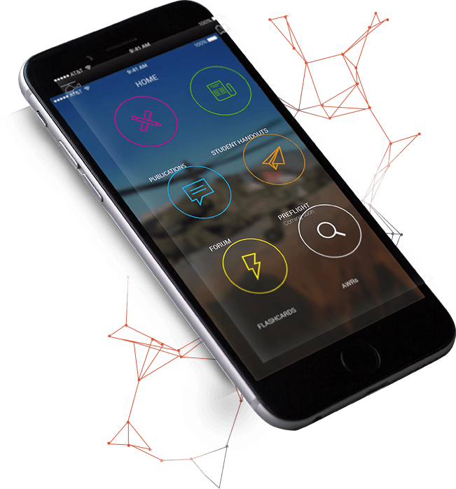
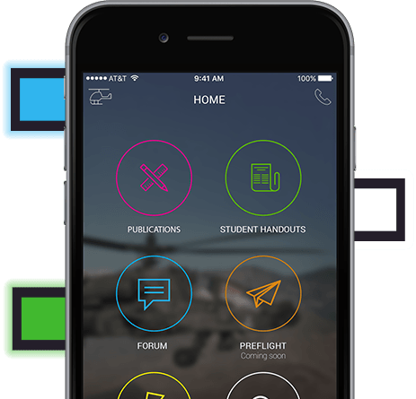
Navigation
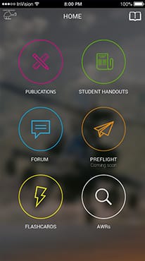
The main page gives a quick access to the required screen. Instead of using the traditional navigation bottom tab menu, we decided to introduce the home screen. This choice was made due to the specifics of app's content. Once user selects a feature, he is not likely to switch back until fully finishes the current one. So we decided to opt for a less distracting navigation screen design.

Publications screen introduces new posts and news on the selected helicopter, which keeps users up to date with recent innovations in helicopters.

Is self-explanatory section that allows reading the content laid out by students on selected model of helicopter. The content is presented in PDF format.

This is a place where users can exchange opinions and post new threads, on which they have questions. If somebody is looking for a specific bit of knowledge, all he/she needs to do is sign in and create a new topic or browse through existing ones.

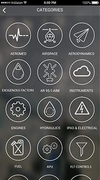
Flashcards tab is the brightest part of the app. It is a quiz which includes many different flashcards covering more than 20 topics related to helicopter piloting and maintenance.
Flashcards
New content and subjects can be created pretty easily, so the client can keep the app up to date. If a user has the desire to see specific flashcard subject, he/she can always send an email and discuss the additional subject.
There are additional options available on the flashcards screen itself:


This can be really helpful if you went through all flashcards several times and have already memorized the order.

The user can quickly switch between different categories straight from the flashcards screen.
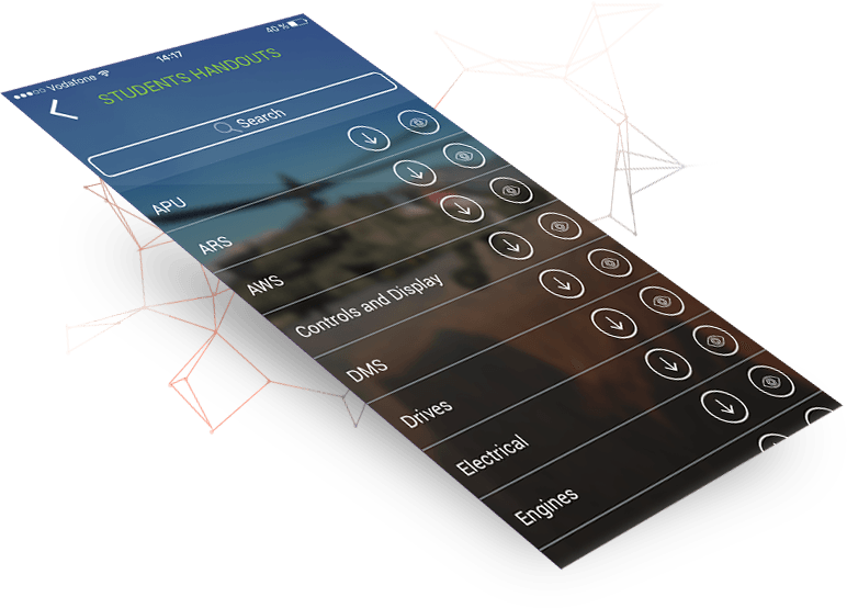
PDF Reader
Since the main purpose of Aviation Study Guide is to help users to study information as well as to verify their knowledge after lessons, the app is very content centered. Therefore, we created a straightforward admin panel which helps moderators to quickly upload new data.
As it happens in such field of study, the content mostly consists of PDF manuals and white papers, thus it was vital for us to integrate PDF reader inside the app. With its help, users can read PDF files without leaving the app or download them to mobile devices and view offline.
There are really lots of resources that are constantly being updated, thus we added a quick search option to help users find educational materials they need.
Road Map
 Splash screen
 Home
Home
 PUBLICATIONS
 STUDENT HANDOUTS
 forum / login
 flashcards
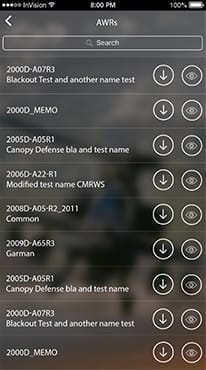 AWRs
AWRs
Design evolution
Logo
The initial naming for the app was "Apache Study Guide", so we played around different helicopter images and tested them in a bundle with text.
While we were working on the logo, our client revised his app's positioning and expanded target audience to all military aviation students and hobbyists. As the consequence, naming has changed to "Aviation Study Guide" and we were asked to use the variation of official US Military Aviation logo for our design.

General Style & Layout Recommendations
The first intention was to take cockpit 3D-models and military theme for app's design as it is used among competing applications. However, during the second review, we agreed with the client that education approach would better reflect the idea behind Aviation Study Guide.
Still, in order to keep students "tuned" into helicopter theme, we put different helicopter models to the background and blurred them. This way users will unconsciously associate studied material with a particular helicopter model, which is one of the hidden values the app provides.
Color Scheme
Each category of Aviation Study Guide has its own color. This is an indirect way to make breadcrumbs that will facilitate users' navigation, once they start associating the sections with a particular color.
One of the centerpieces of the application was flashcards' design. They had to be simple, bright and easy to grasp. We adhered to internationally recognized colors and symbols: green with check mark for Yes and red with X to No.
All app's screens were kept in dark colors. The only exception was made for the forum page, where users will spend a lot of time reading and chatting.
Application icon
App's Icon. Because the app contained lots of study materials and PDF-documents, we wanted to convey this value through icon design. We offered several variants of handbags and folders with papers that would indicate the presence of extensive knowledge base inside the app.
Then we put previously created Aviation Study Guide logo underneath the folder and painted the icon in shades of blue in order to stick to the aviation theme.

Features and Achievements
The initial application was submitted to the Apple Store with a really basic interface. However, we have enhanced its appearance over time. The application is constantly updated by our team as the client continues to order new features. Therefore, users can expect new, bright features in the future.

Forum

3D Touch

PDF READER

Flashcards
...Rated 4+ in the Apple Store
More than 10k downloads
...
Great reviews only
I'm very happy with how the APP has turned out! I look forward to working with your team in the future! Conveniently for both of us, we have a few more helicopters and a few more dollars to spend! It's going to be a few more months. At least after the New Year. But I'm very excited!

Order Similar Project
Just contact us and we will do the rest!